WEB ACCESSIBILITY
INCLUSIVE DESIGN
Accessibility for all…
Whose job is it to ensure the web is accessible for everyone? What are the problems UX can solve?Who are we solving for? Who do we design for?

Vision
Zooming limitations, contrast & text
Hearing
Video closed captions, volume, & sign language
Physical
Keyboard input, touch targets, & gestures
Learning
Consistencies, learnability, & error management
What can UX do?
Many solutions to these needs depend on the development team for code related to screen readers, alt tabs, closed caption videos, keyboard and gesture inputs.
So what can we do in UX to maintain inclusion? Color contrast, font/button size, understandable copy, object consistency, and so much more. The opportunities are endless.
For this study, I’m going to improve my previous design for a native application our team made for Music Midtown
By focusing on color contrast, consistency, buttons, touch targets, focus indicators, typography, language, and layout, I will be able to transform our existing prototype into a prototype accessible and inclusive to all. Color Contrast:
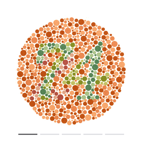
Ishihara color blind test
1 in 25 men are colorblind, and 1 in 200 women are colorblind. 98% of colorblind have Red-Green Color Blindness. Depending of the level, any of theses number would be illegible.
The Ratio:
TEXT: {4.5 : 1} color contrast from foreground to back ground
LARGE TEXT: {3 :1} color contrast from foreground to back ground
Original Tutorial Ratios

Orange & White
Hex: #F76242Ratio: 3.09 : 1
Green & White
Hex: #87b8522.33 : 1
Blue & White
Hex: #75d1f31.72 : 1
Pink & White
Hex: #ef3d8b3.67 : 1We took the colors in our tutorial from the colors represented in the Music Midtown posters and illustrations. However, with white text in the foreground, none of these colors passed the ratio test. We can improve this by changing every instance of these colors to a passing color scheme.


Consistency & Actions
Being consistent in call to action buttons and patterns throughout a digital product greatly improves accessibility for physical and learning disabilities. From screen readers to tab features, touch and gesture buttons should be at least 44px x 44px and have defined color coded access and error management. Always using consistent language and focusing on back and skip features in any optional action.
Music Midtown
Button Focus

Emphasis
To make the buttons’ color contrast accessible and to define the outline and action related to each button. This helps not only those with difficulties in vision, but learning disabilities as well, by creating consistency in action and language.

Size
Assuring each button has at least a 44px by 44px. Call to action buttons become more accessible for touch, gesture, and physical disabilities, as well as the elderly.

Focus
Button shape and size is important to create consistency within a product. Any button that is a call to action and results in any financial charges, sign ups, or will move to a new page should be distinct.

Typography & Learnability
Typography can be a beautiful and subtle way to express a product’s brand or identity. But copy also carries weight to be the most direct information about a platform. This typography, developed by Dan Britton, is meant to demonstrate the hardships of what reading can feel like for someone with dyslexia among other reading and cognitive learning disabilities. For this reason, sans-serif and weighted fonts are recommended for dyslexia readers.
And who said legible can’t be beautiful?
Typography

Coyote
The type used in the current Music Midtown application is Coyote. A sans-serif font, but with line breaks and disruptions throughout the font, it could cause some users to struggle with comprehension.

Open Dyslexia
Designed by Abelardo Gonzalez, it’s specifically geared to assist dyslexia readers. By demonstrating physical weight to the lower end of the type, it guides a user’s eyes to follow the line of information more clearly.

Poppins
A sans-serif type that displays clear lines and drops below the line on text in lower case to help guide the user’s line of sight and focus to the information. This is the font currently displayed on my personal portfolio.
The Results
Style & Object Guides
By creating a style and object guide, you can:
Check color contrast for all color palette combinations.
Create consistency in all button patterns, including size.
Determine the best Typography, weight, and size for a product.
