Music Midtown
A New Native Application for Music Midtown Festival
Overview
For this project we were given two weeks to complete research in order to find an existing pain point with the Music Midtown digital experience and improve upon that idea. The research and design process included competitive and comparative landscape analysis, surveys, interviews personas, empathy and journey maps, user flows, wireframes, and prototyping.
Data
| Project Type : Two week Sprint
| Time : March 2020
| Project : 4 person group project
| Skills : Research, Interviews, Visual Design, Wire-framing, Content Strategy, User Testing,
| Tools : Sketch, Adobe Photoshop
The Process

In this group project I served as project planner and strategist, as well as research. Each deliverable was a team effort but I took lead especially in terms of our users emotional journey. Conveying emotional data through story boards, experience map, empathy map, and a journey map.
First Step… Survey

Have you used the app?

Who did you go to MM with?

How did you first hear about MM?
We had great luck with 41 survey responses! The surveys helped us narrow our scope and begin to tell the tale of our persona.

User Interviews
6 Users Interviewed
4 Women, 2 Men
All attended the festival
We took all the key pieces of our interviewees data and created an affinity map.


AHA Moment!
After several rounds of sorting we ran across a road block. A strong pain point from all our data was the lack of service to use your phone at the festival. A problem we originally thought we could not fix. However we realized if we created a strong enough MVP it could sway our stakeholders to change their practices with the grid. And from that insight Sia was born.

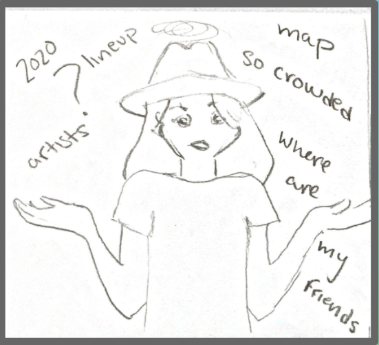
Sia’s Problem
A frequent Music Midtown patron, Sia struggles to navigate the festival crowd and keep up with her friends. In addition to this, the unfamiliar artists in the lineup make her hesitant to attend the festival this year.
Our Goals
A native application that personalizes and enhances her festival experience by:
Allowing her to track friends at the festival
Showing real time crowd density levels
Curating a lineup discovery playlist based on her music tastes
“Let me tell you a story all about how…”
The importance of emotion was my strong suit in our group and I was tasked with shaping a story of Sia’s festival adventure.


Journey Map
In order to make her story a reality we had to examine the journey attending this festival was.

Current State
By examining her current journey map we were able to see the downward trajectory of her frustrations at the festival when she can not find her friends and she can not navigate the crowds.

Future State
Looking toward a future state with this application in mind we can see that with the ease of navigation the overall experience increases, which means she is also more likely to return in coming years.

Past to Present
Design
Together as a group we began our design process with design studio. We all grabbed the nearest dry erase marker and went to work on a table.


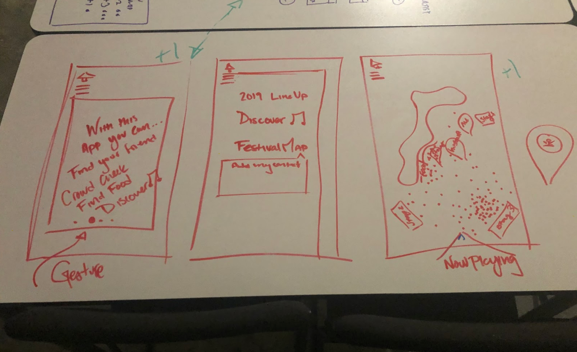

User Flow

Navigation Features
After creating a profile, any user could add friends from their contact or number to know their location during the festival.

Highlighted path to represent the ease of creating your own personal playlist.
With the base construct of our wire frames laid out, from our design studio, our team member Thomas began creating our first iteration wireframes.
Wireframes
1st Iteration

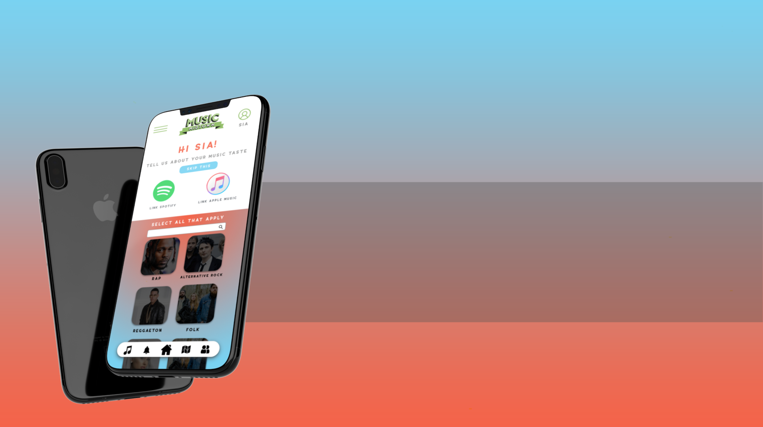
Home Screen
The home screen of the app is meant to display the line-up with intuitive simple navigation. The number answer in response to “why did you download the MM app” was to keep track of line-up so we kept that feature promonate.

Map
Once logged in to the app you have the ability to toggle between viewing the density of crowds or location of your friends on this map.

Playlist
To introduce guest to new artists in the MM lineup a user can connect with either Spotify, apple music or take a brief quiz to get a custom playlist of songs that might interest you.
Usability Testing
After creating our first wireframe prototype we were able to set up three rounds of testing to get the most data we could before moving forward into mockups
Iterate

Tutorial
To end the tutorial about the MM app it confused some users why the button said ok instead of done or complete.

Home
We first designed the tutorial with an overlay over the home screen. But it was friction for the users that did not understand why the could not click on the other actionable buttons behind the pop up.

Login
On the login information page we have asked for contact information, but were not specific enough to clarify first and last, just first or a nickname.
With all of the comments and more from testing we were able to remain agile adjust quickly and build our high fidelity prototype:

Mock - Up
The video process above bring you from initial login in through the process of getting a new customized playlist with MM artists. And then finally to our MVP item the navigation feature to toggle between your friends locations and crowd density.
Interact with our prototype below!

Conclusion
In this process we learned a lot as a group and as individuals. Communication is key when in a sprint, and we never lost site of our users goals along the way.
If we were granted more time in the future, I would like to perform more user testing with our mock up state and begin to iterate on the data.
The Team:

Angil Tate
Research
Strategy
Visual Designer

Brooke Lewis
Research
Strategy
Project Planning

Christian Garcia
Research
Interaction Designer
Visual Designer

Thomas Freeman
Research
Interaction Designer