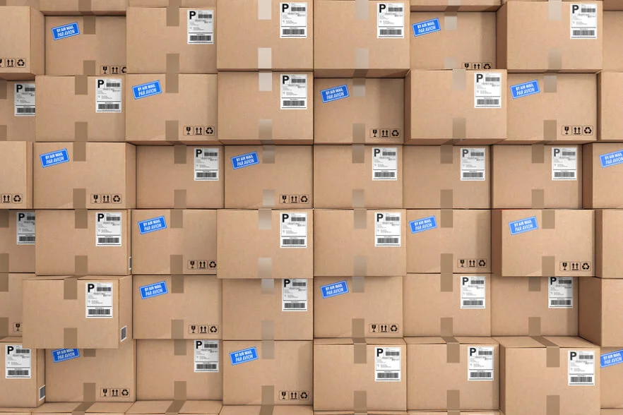
Hello Package
Logistics are changing today more than ever. Hello Package is a SaaS company built to improve user navigation and fulfill residential package needs.
The start:
Hello Package’s CTO selected our team to improve their UX capabilities.
The guidelines given were to improve any element for any user of Hello Package. Essentially free range!The Process:

From the general guidelines given by the clients, The Plan emerged:

STEP 1: RESEARCH
The Site Visit


From the site visit we were able to grasp the full picture of the products purpose for the users. Context provides all the clues to move forward into more research.

Market Research
Evaluating Hello Package’s competitors and comparing their software to traditional LEMES functionality with overall comparable applications.
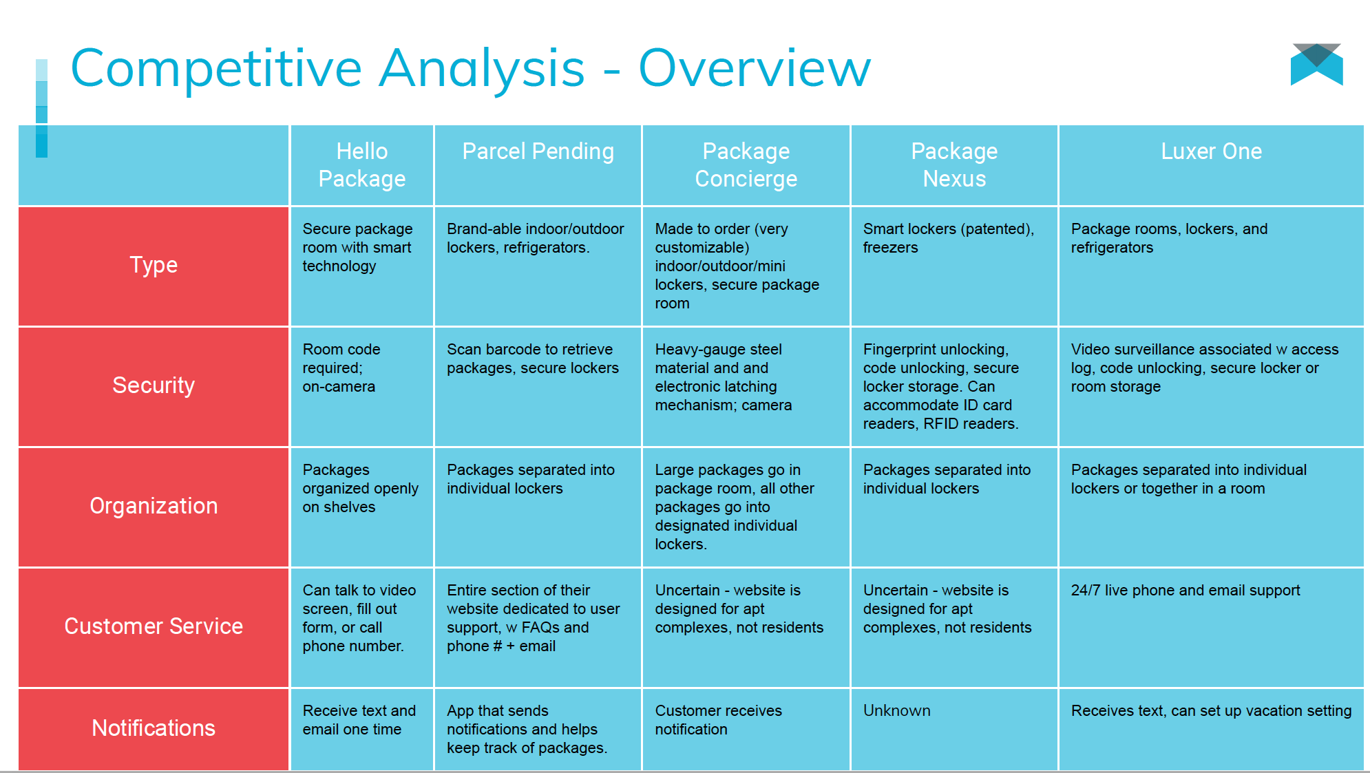
By looking at Hello Package’s direct competitors we were able to access what each product was offering and compare its usability to Hello Package’s current site.

Using the LEMES technique we compared Hello Package’s mobile application with other successful application and ones the stakeholders were using for emulation.

User Research
Surveys, Observational, Interviews… OH MY!
User Surveys
First we sent out surveys to the current target audience through apartment complexes and social media.
From this data we were able to begin compiling data onto a whiteboard for affinity mapping later.User Interviews
Methodology:In-Person Interviews with 3 carriers, 7 residents, 1 employee
Wanted to understand likes, dislikes, pain points, and opportunities
Goal was to gain insight into their package delivery and receiving process as it stands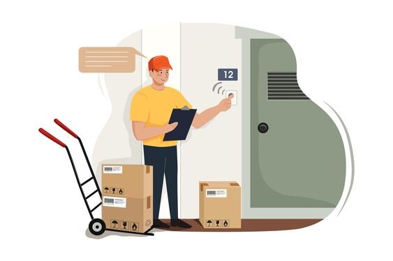
User Interview Insights

Observational Footage


We were granted access to Hello Package security cameras to observe users interacting with the package room. Key insights:Easy to get confused when shelves are fullResidents move packages to other shelves/floor to find their own
User Flow

STEP 2: SYNTHESIS
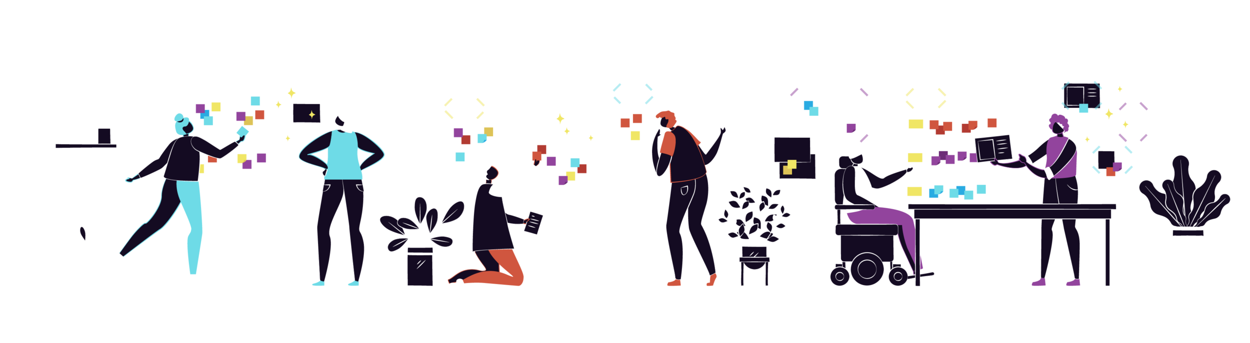
Combining the breadcrumbs to a finished puzzle will bring us clarity in our vision

Before……After

4 Primary Concerns became clear

Notifications

Customer Service

Security

Convenience
After these insights a persona appeared….
After Jamie was clearly defined by our research and insights. We were able to see what was important to her, and what her pain points were.Defining the problem statement…
“The resident needs a more convenient, intuitive, and secure package delivery experience so that they can feel confident in receiving their items”

Convenience
Customer service, 24/7 access at their fingertips
Intuitive
Plain and simple - the system and process needs to make sense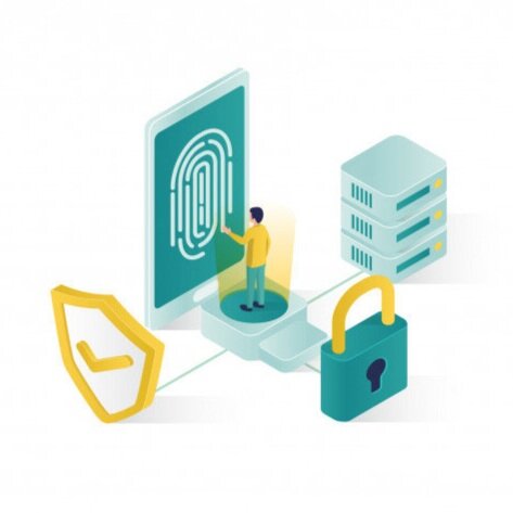
Secure
Residents need to feel that their personal deliveries are safe and sound
With our persona and problem defined we took a journey, to see what the current state of receiving a package looks like and where we can improve.The Solution…

The resident needs a more intuitive application interface tailored towards resident package deliveries.
By updating the app with a tutorial and revised notification settings, residents will confidently understand the Hello Package system and enjoy a pleasant user experience.
A storyboard of Jamie and her new package system…

2: App Tutorial

3: Package Arrival Notification

1: Download Hello Package App

4: Finds package in mail room easy after tutorial

5: Jamie happy at home with her package
Step 3: DESIGN

Bringing the research to life in a tangible way

Design Studio:
We started with a quick session design studio to get ideas flowing and basics of the features look in place. Important features were: Customer Convenience, giving the user access to customer service from any screen; Notifications, having multiple locations of notifications; Security, demonstrating the value and level of security Hello Package takes in their product; and Education, adding a tutorial and tips to create a learnable navigation of the application.
From sketches to wireframes

Step 4: Usability Testing
Our Testing:
6 - Users Tested Designs Remotely
5 - Tests were Conducted
13 - Total Screens Evaluated

First iteration…
Looks too much like the tutorial
Print too small for A11Y standards at bottom icons
Rounded edge appears this page is a pop up

Second Iteration…
Not sure what was clickable
This page looks more like a dashboard
Liked the scroll icon for more information

Final Iteration…
Indicating click-ability with skeuomorphism
Made the dashboard less busy
The transition of the home page especially was drastic after our usability testing Moving forward after usability testing and into High Fidelity product I created a basic style guide to remain with Hello Packages brand and keep cohesion throughout the users experience.

Keeping in mind one of our most important features for this MVP was the tutorial.


Explaining to Jamie and any user the value and navigation of the product with text and visuals.Final Prototype
By focusing on the four key insights of Notifications, Customer Support, Convenience, and increased knowledge of Hello Package’s Security measures the residents, like Jamie, will feel the app exists for them. They will be ready with the all the information needed for an intuitive and delightful experience starting with a friendly Hello.
Next Steps:
Moving forward & other researchAdditional mockup usability testingAdditional UI elements and best practicesSync with development to determine feasibilityAdding in UX recommendations of future updates into roadmap

